branding
Feature summary
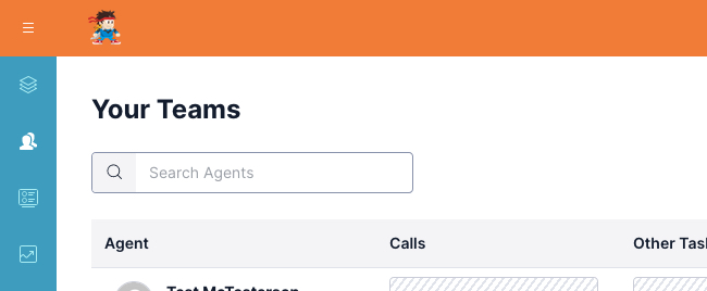
The branding feature allows you to customize the appearance of the Flex interface to better fit your brand. The "Twilio Flex" logo can be changed to your own graphic, and the colors for the header and side navigation can be modified.
Example screenshot
Configuration
The branding feature has several settings:
enabled- Set totrueto enable the featurecustom_logo_url- If you would like to replace the Twilio Flex logo with your own, set this to the URL of your logo. It will be scaled to a maximum size of 240x36.- Tip: You may upload your logo as a serverless asset by placing it in the
serverless-functions/src/assetsdirectory. In this setting, place{{serverless.url}}within the URL to reference the serverless domain. For example, if my serverless asset is atserverless-functions/src/assets/logo.png, set this setting to{{serverless.url}}/logo.png.
- Tip: You may upload your logo as a serverless asset by placing it in the
use_custom_colors- Set totrueto use the colors set in thecustom_colorssection below.custom_colors- Colors to use whenuse_custom_colorsistrue. Each color must be a valid CSS color, such as hex or rgb format.main_header_background- The background for the header across the top of the page.- Tip: Set this as a darker color to improve contrast.
side_nav_background- The background for the left-side navigation menu.side_nav_border- The color of the border between the navigation menu and content.side_nav_icon- The color of icons in the navigation menu.side_nav_selected_icon- The color of the selected icon in the navigation menu.side_nav_hover_background- The background when hovering a navigation item.
component_theme_overrides- Here you may configure any valid customizations via component theme overrides. This allows you to customize the CSS of any component exposed via Flex's theming interface.
How does it work?
For setting the logo, the MainHeader component exposes a logoUrl prop which can be set by this feature.
For setting the colors, the component theme overrides for the MainHeader and SideNav components are set.